
Well House is the transformation of a late Victorian terraced property in East Dulwich
Sited on a narrow, and tightly packed sloping site, the existing houses are narrow, dark and disconnected, lacking storage and meaningful relationships with the garden. The owner, a young professional, challenged me to create a home that could evolve to meet his needs over the long term and make use of every available inch of space.
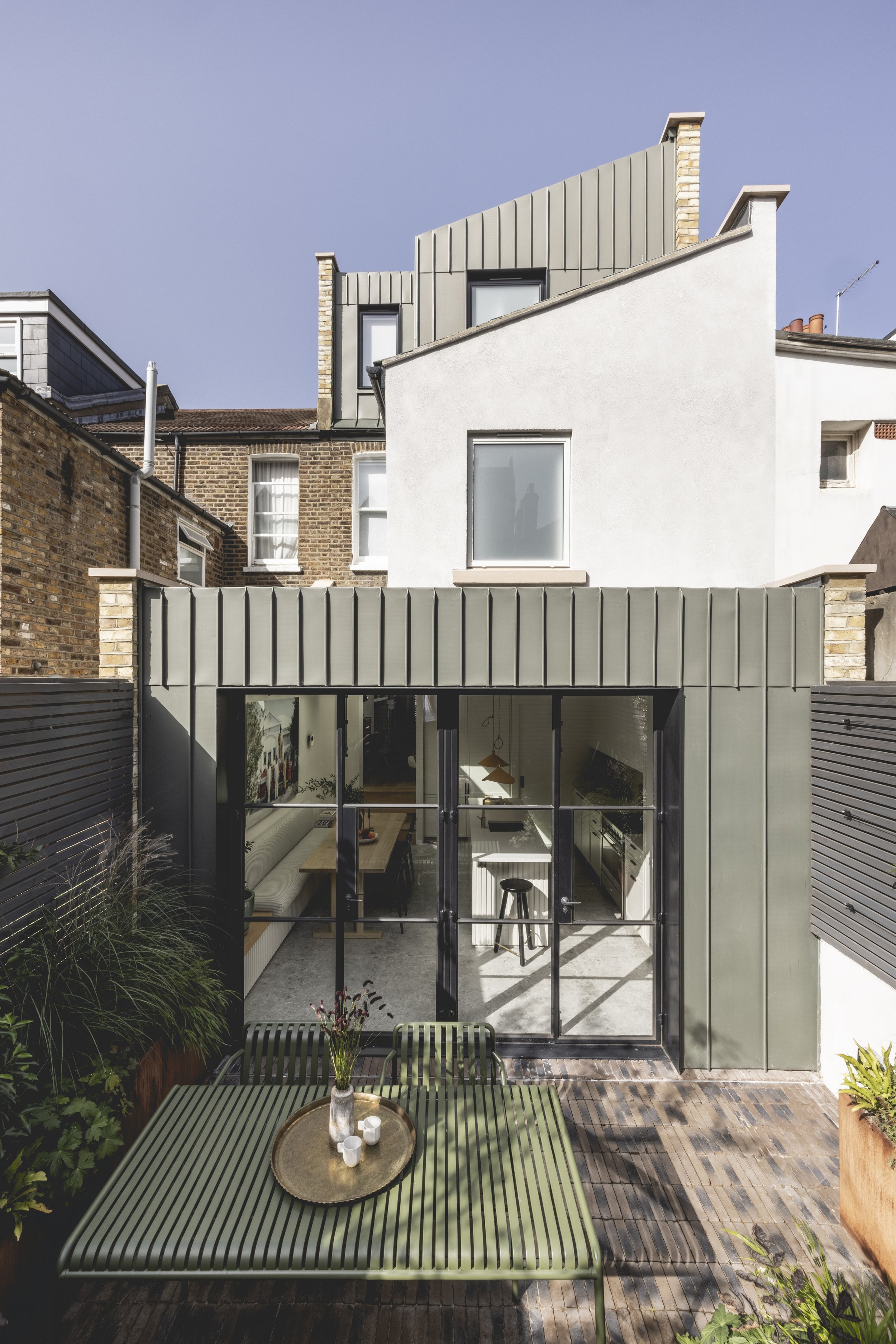
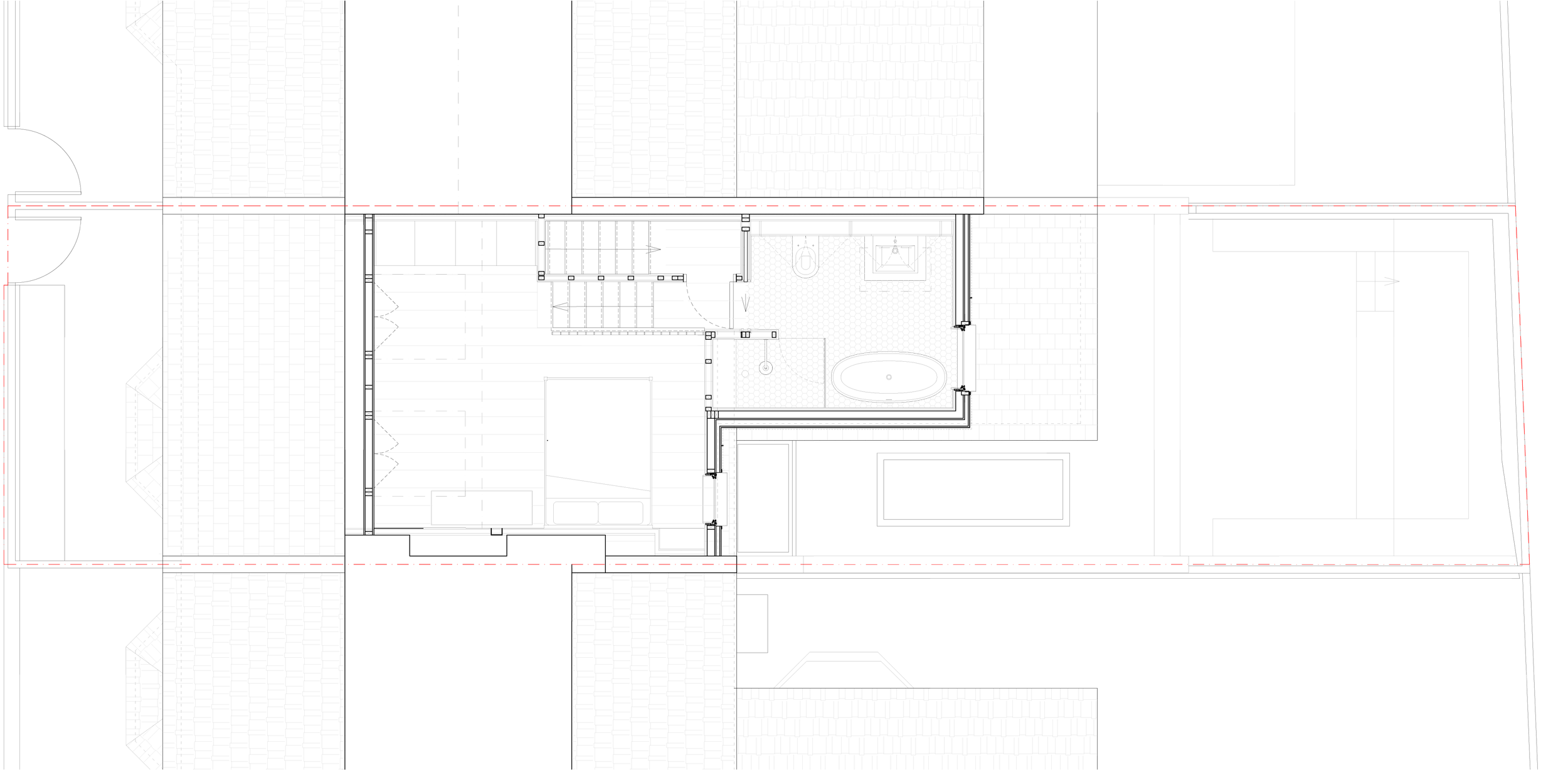
I developed a design for a lightweight metal clad infill loft and ground floor extension, with extensive structural works allowing us to shift floor plates and walls around, adapting a typically mean circulation and storage allowance to my client’s requirements and adding additional bedroom and bathroom accommodation. The resultant unique design revived the existing spaces, opening them up to the garden to bring in more natural light without compromising privacy.
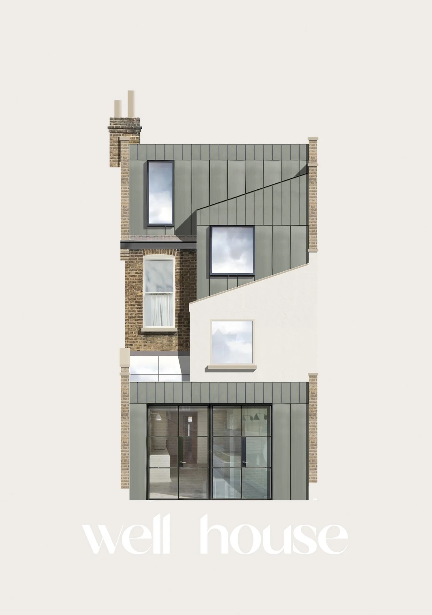
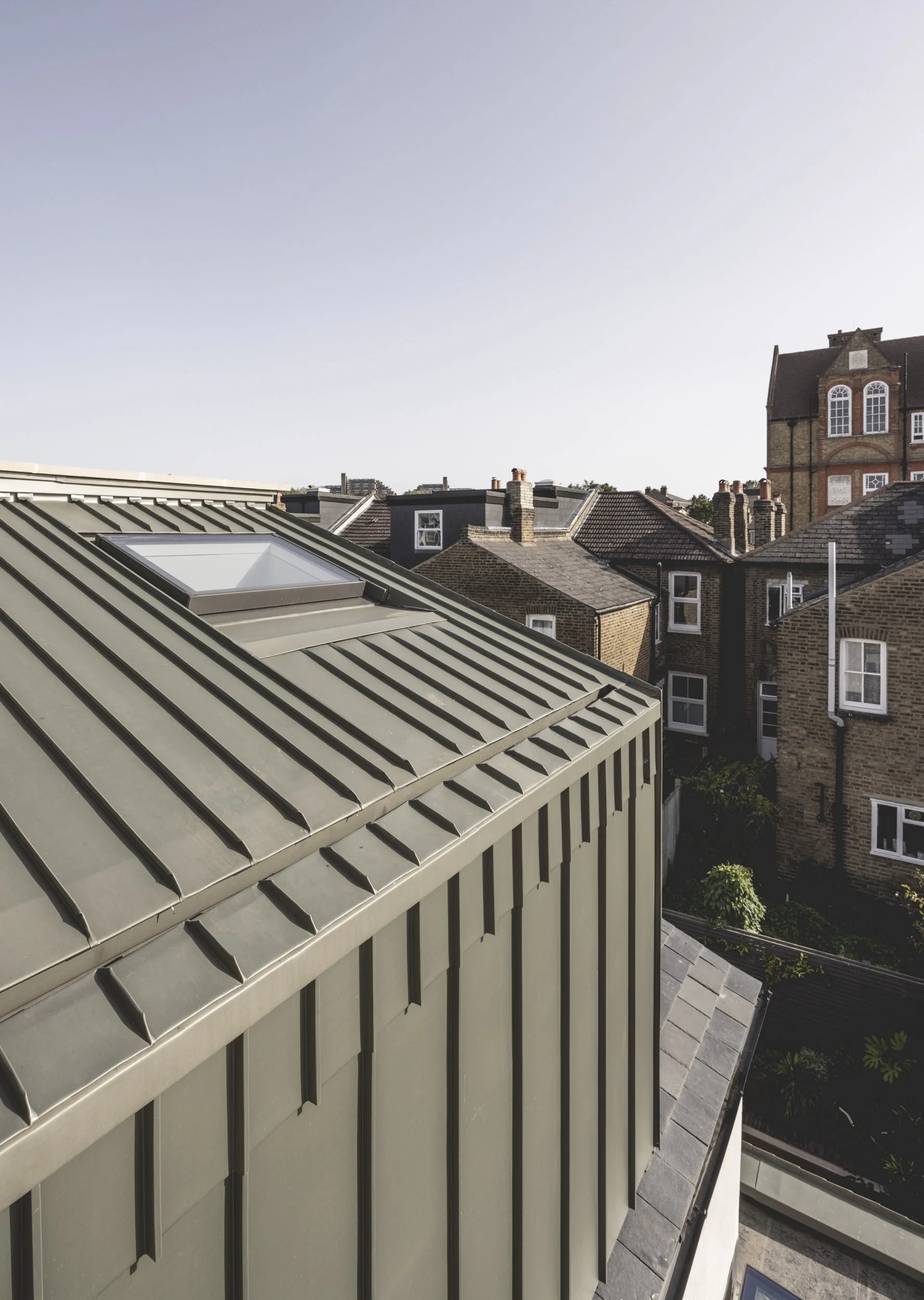
Externally I looked to the original form for reference, the full width forms are flat roof and orthogonal and the half width closet wing dormer playfully replicates the existing sloped roof, resulting in a cohesive massing.
A strong rhythmic vertical motif derived from the concept of the house jostling for space in the tight urban terraced plot. This manifests itself in the zinc standing seam cladding, chosen as a contemporary and streamlined interpretation of the linear patterning seen on more traditional rolled lead roof forms. The two widths create rhythm and repetition across the facade. This patterning is repeated throughout the scheme.
“Squeezing a spacious, sociable kitchen-diner into a compact Victorian terrace is no mean feat, but this clever side and rear extension has nailed it, while also seamlessly connecting to the garden. Arguably the smartest move was the decision to lower the floor level to create a more generous head height, enhance privacy and minimise the extension’s impact on the neighbour’s light and amenity.
”


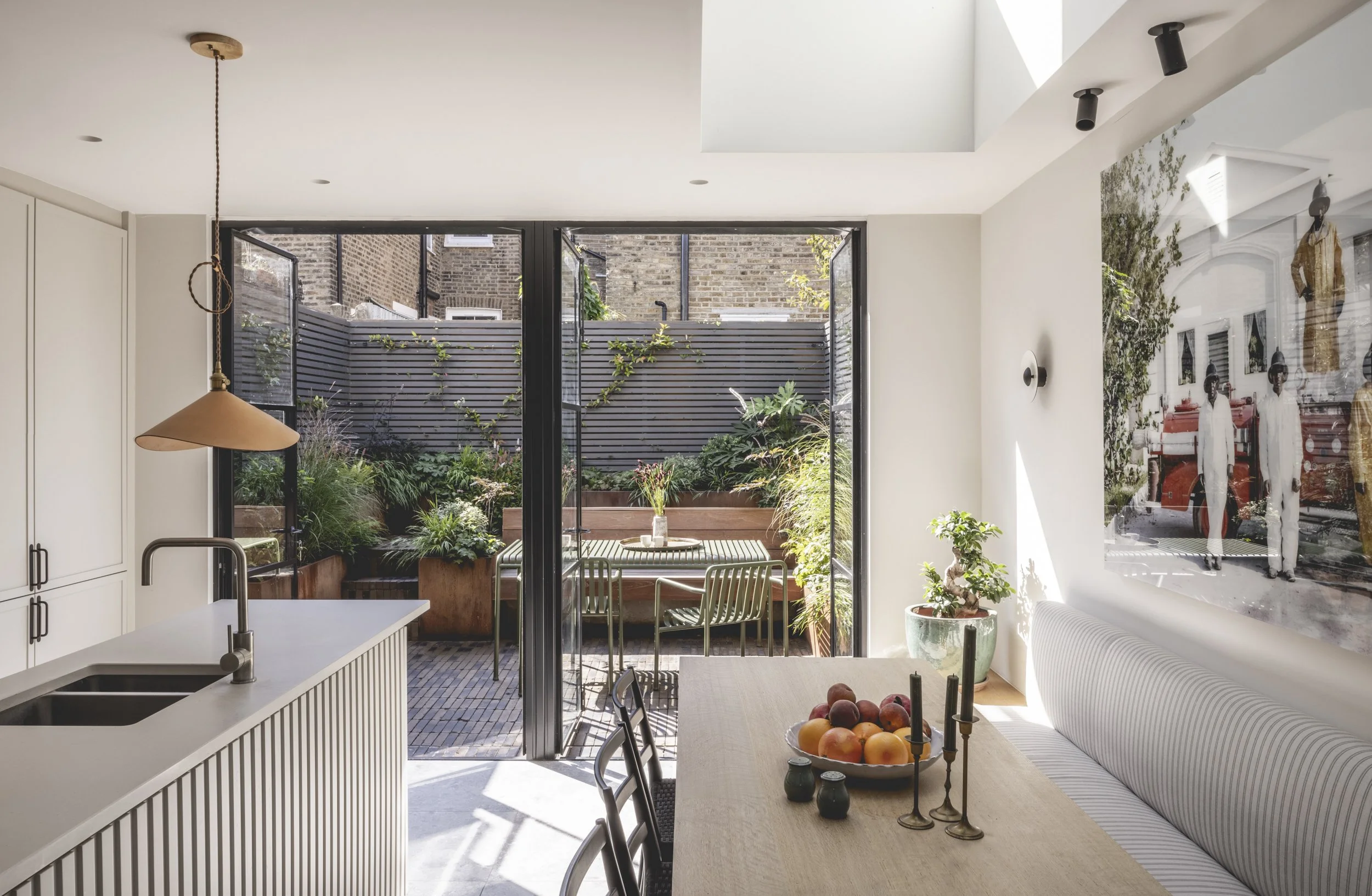
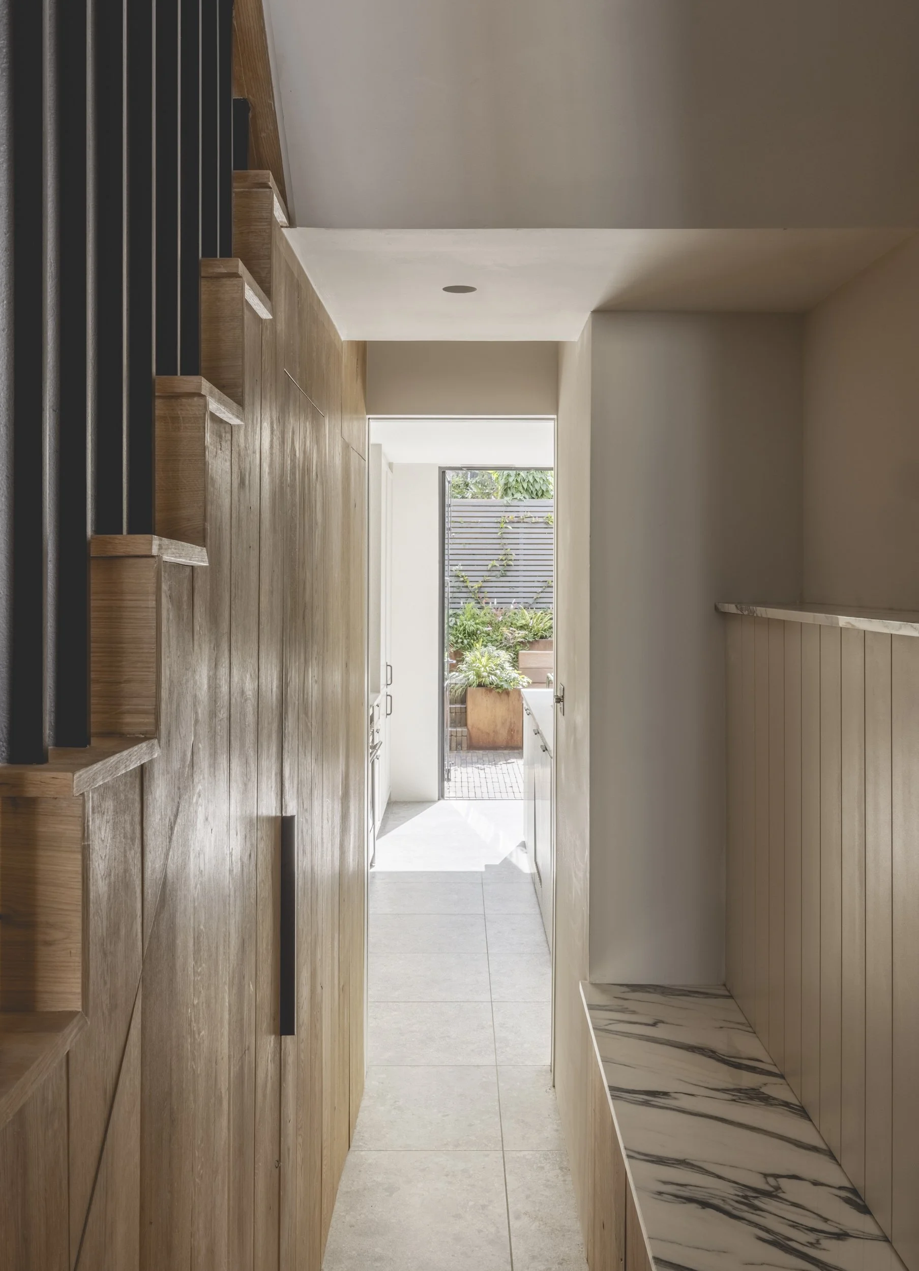


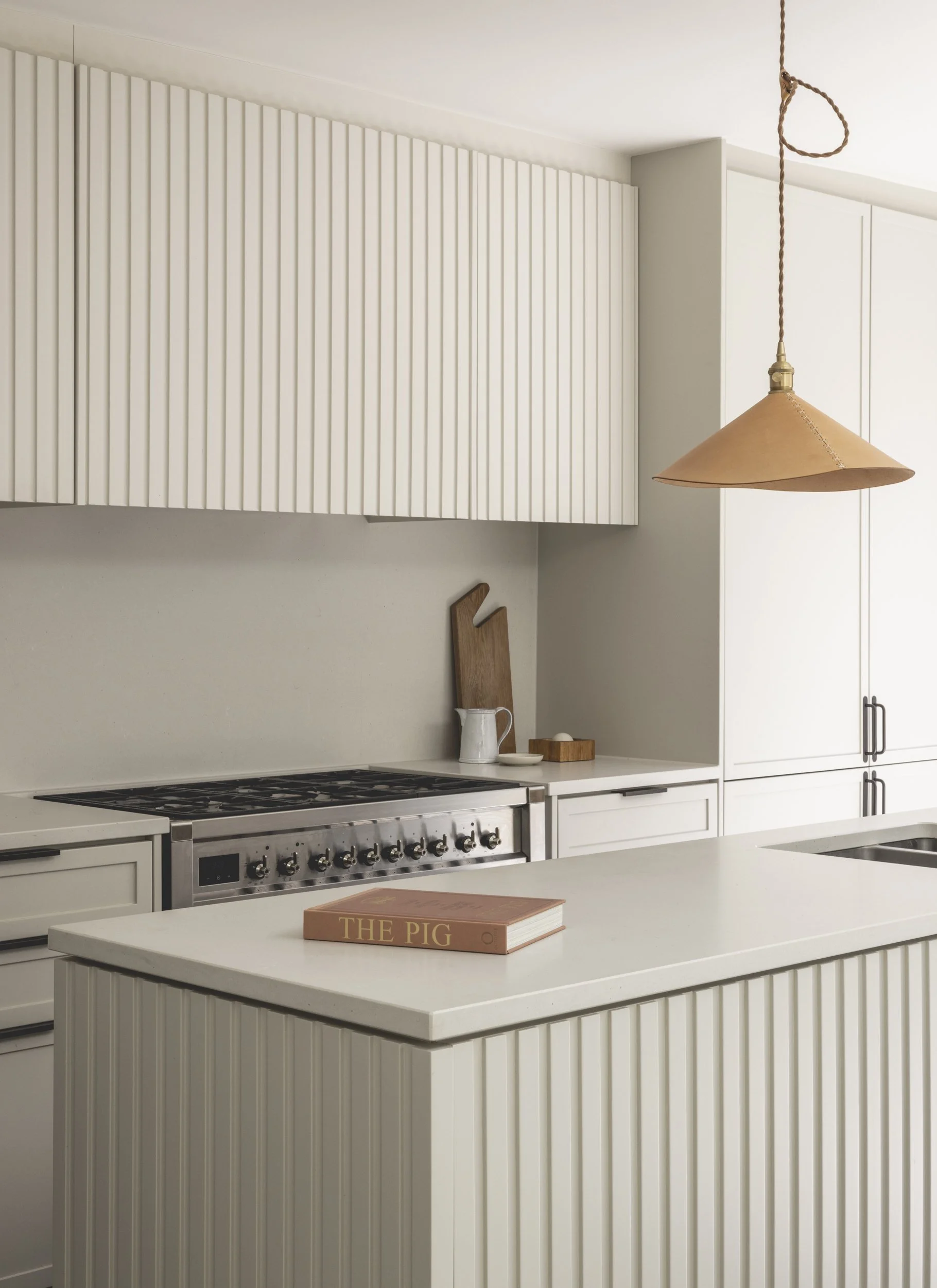
Key to the regenerated layout was a generous garden facing kitchen that I designed as a place to cook, work from home and socialise. Here, a full length bespoke bench stretches the length of the space and morphs into the stepped level change, creating a dynamic space for formal dining as well as more casual seating in the narrow plot.
Working closely with interior designer Christian Bense, the rhythm of the zinc façade translated to a decorative and formal motif that gave a rigour to bespoke wall finishes and a whole house replacement feature staircase. As well as the more playful touches like a purpose made hand tufted rug with maker Amy Kent.


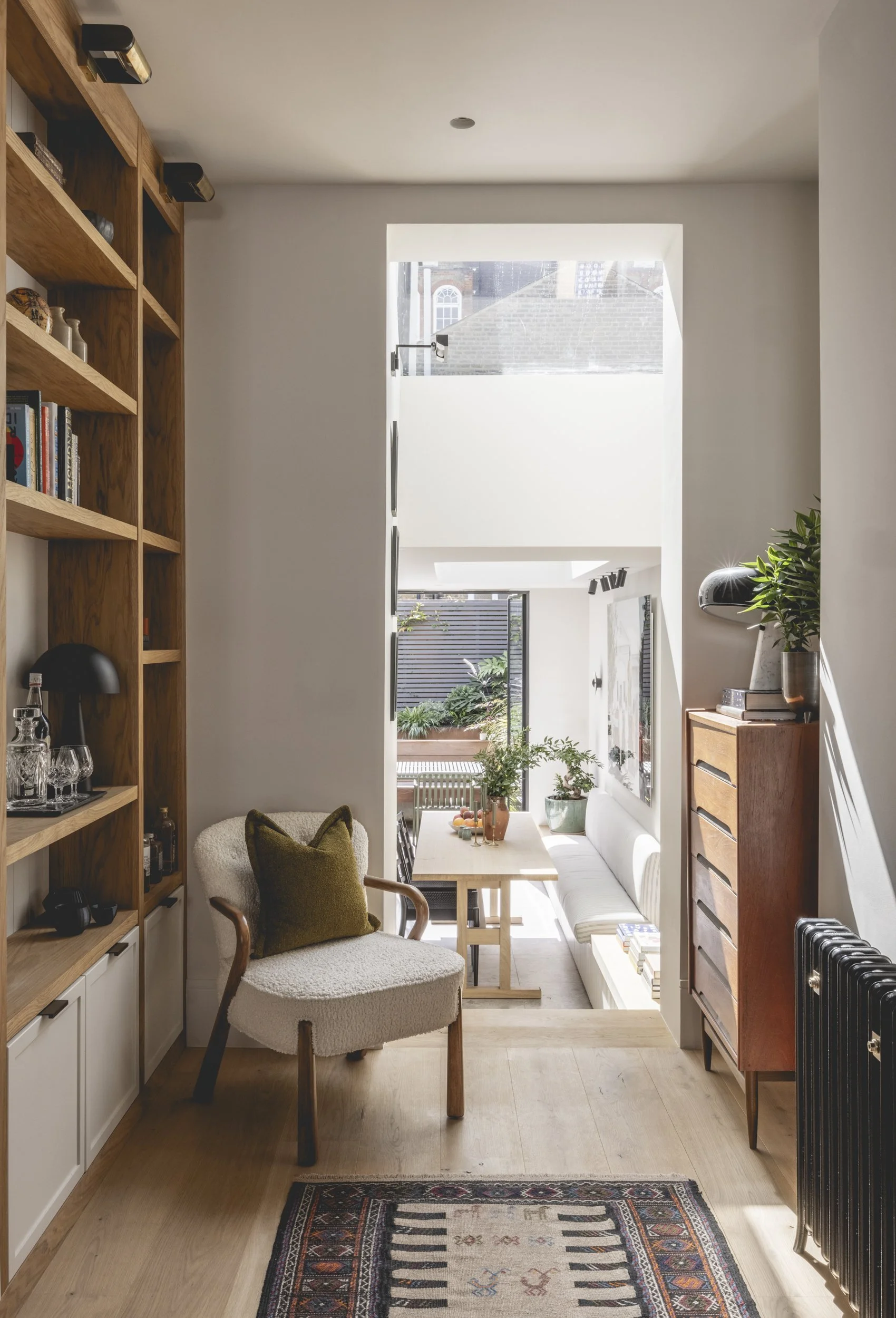


Lottie Delamain’s landscape design opened up the sloped site from the house and brought the sunken terrace to life. Clever layering of levels, planting beds and built in furniture maximised the small space in earthy tones of corten steel and Dutch clay pavers. The sculptural forms of the plants cast painterly shadows on the more industrial elements, softening this urban retreat.
Photography: Billy Bolton